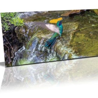
Before actually painting the feature wall, I decided to do an artist impression of how it’ll look with the different proportions of white, turquoise, and dark blue.
It may be time-consuming to plan before painting but remember the saying
“If you fail to plan, you plan to fail..”
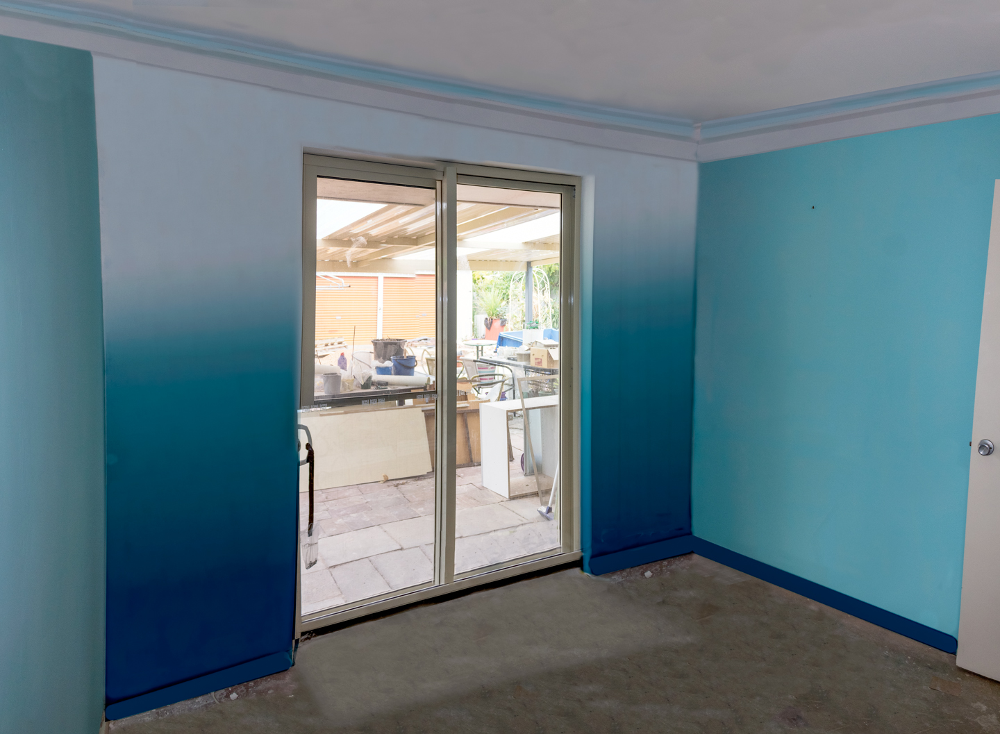
So with that in mind.. I went about to take photos of the room.
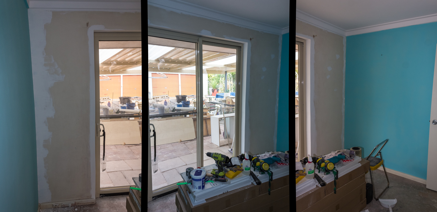
As it is a rather small room, I had to use a 3 shot approach to be able to capture the crucial elements.
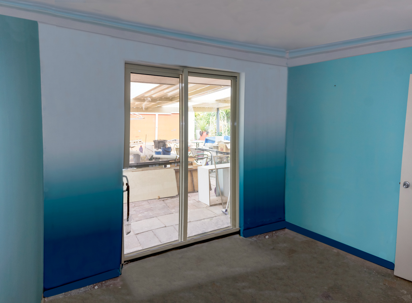
Used to test out the proportion of the colours white, turquoise and dark blue
Enjoy,
Grace-yi
I had to do quite a bit to the photos. 1st I had to stitch them together.
Then I had to fix the wide-angle perspective
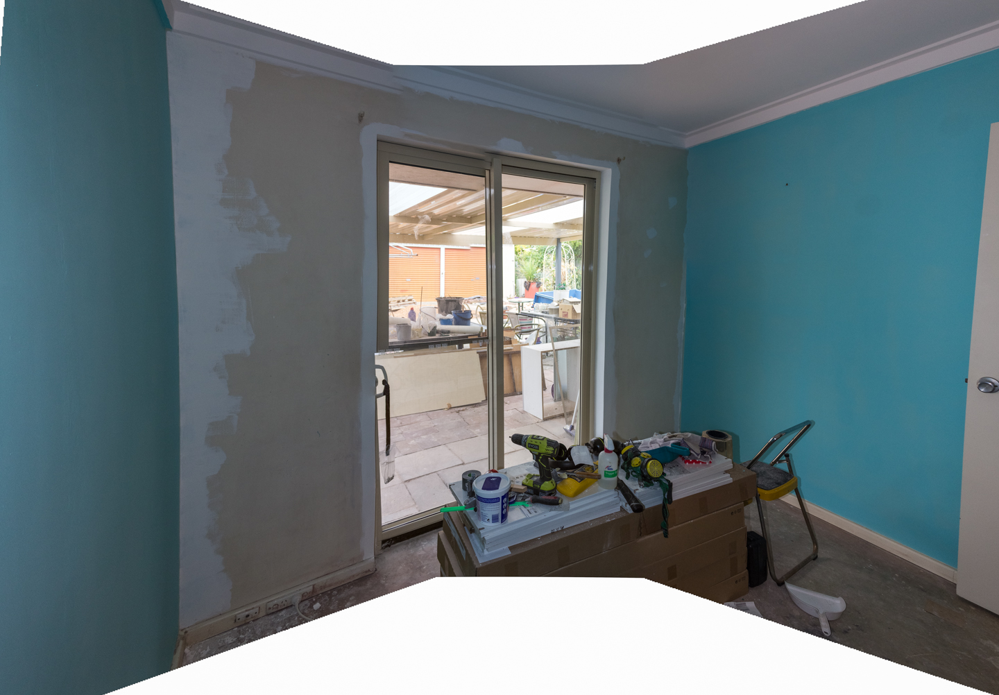
After which I had to remove the “mess” in the middle of the room which was the most challenging aspect of this photo retouching.
I also fixed the cornice so that it is in the right spot.
Also brightened the photo so that it looks bright and welcoming.
After which I went about and worked out the proportion of the 3 colours and how it’ll look like if I had 3 parts white instead of 2 parts white on the top.
Below is the final artist impressions
Used to test out the proportion of the colours white, turquoise and dark blue
Used to test out the proportion of the colours white, turquoise and dark blue