Before actually painting the feature wall, I decided to do an artist impression of how it’ll look with the different proportions of white, turquoise, and dark blue.
It may be time-consuming to plan before painting but remember the saying
“If you fail to plan, you plan to fail..”
So with that in mind.. I went about to take photos of the room.
As it is a rather small room, I had to use a 3 shot approach to be able to capture the crucial elements.
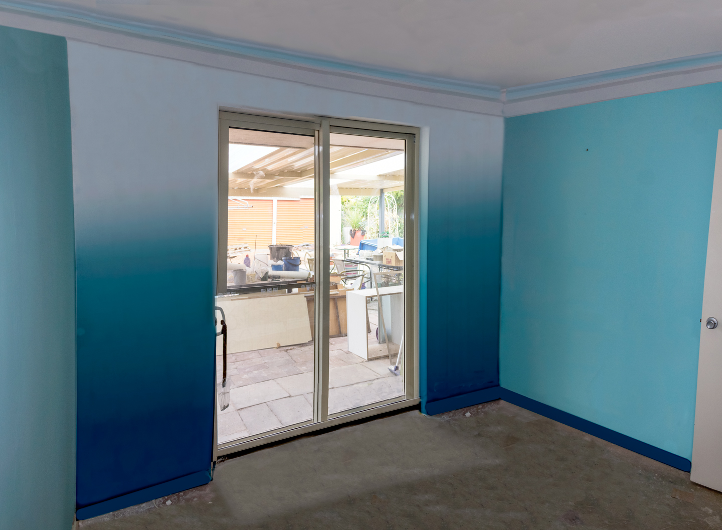
Used to test out the proportion of the colours white, turquoise and dark blue
Enjoy,
Grace-yi
Continue reading Creative Studio Feature Wall Artist Impression | Photo Retouching