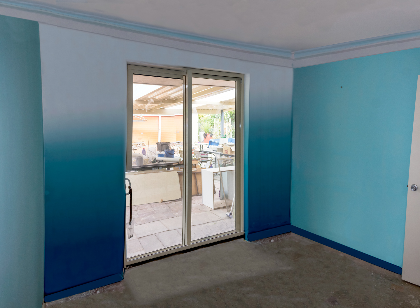
Before actually painting the feature wall, I decided to do an artist impression of how it’ll look with the different proportions of white, turquoise, and dark blue.
It may be time-consuming to plan before painting but remember the saying
“If you fail to plan, you plan to fail..”
So with that in mind.. I went about to take photos of the room.
As it is a rather small room, I had to use a 3 shot approach to be able to capture the crucial elements.
The final artist impression 2 part white, 3 part turquoise and 1 part dark blue Used to test out the proportion of the colours white, turquoise and dark blue
During the previous weeks we have been arduously preparing the walls in our creative studio for this moment.
It’s time to add colour to this blank canvas:D
So excited! I wanted to do something special for the feature wall which is the wall with the sliding door.
Here is just a sneak peek of what I plan on doing;)
Click “Continue Reading” or scroll down for an artistic impression of the wall in the room.
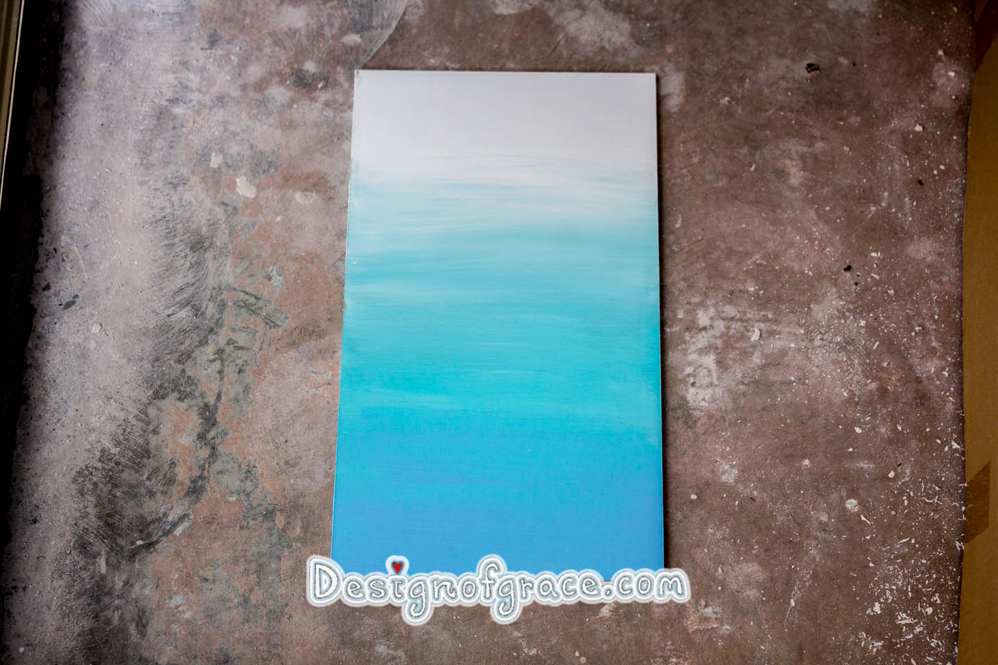
I did a test run with the colours and the technique of creating an ombre [aka gradient effect] on a mdf board. Not quite happy with the cottonblue on the bottom.. It has too much a purple tinge. So we went to the shops and looked for a darker colour which will be perfect for the skirting.Enjoy,
Grace-yi